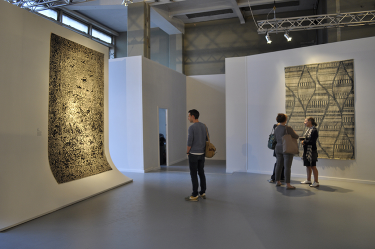
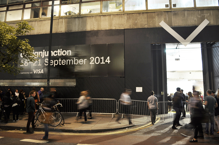
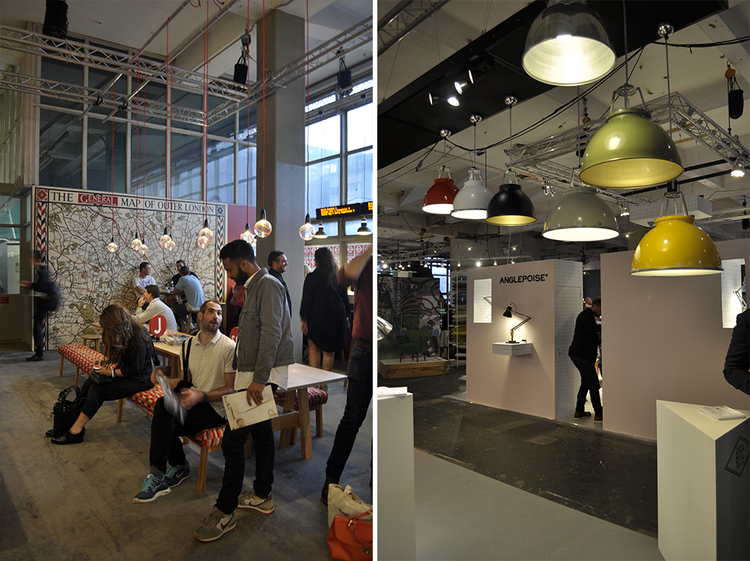
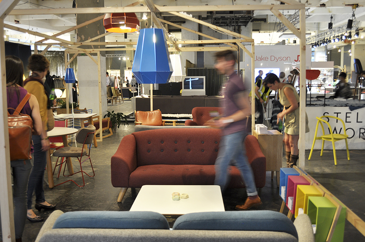
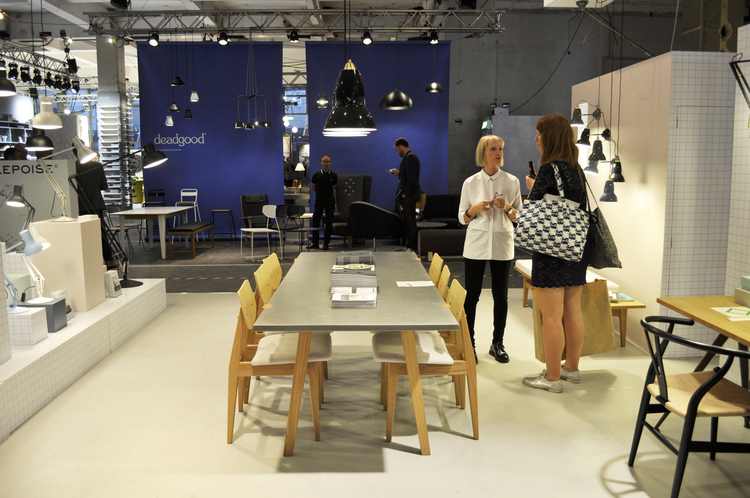
designjunction is a design trade show presenting the very best in product, lighting, furniture and graphic design from around the world. Every show is full of beautifully crafted objects featured against the stunning industrial backdrops of the The Old Sorting Office in London. It’s been said that designjunction has created the perfect balance between creative and commercial, “offering a much-needed alternative to the traditional trade show”.
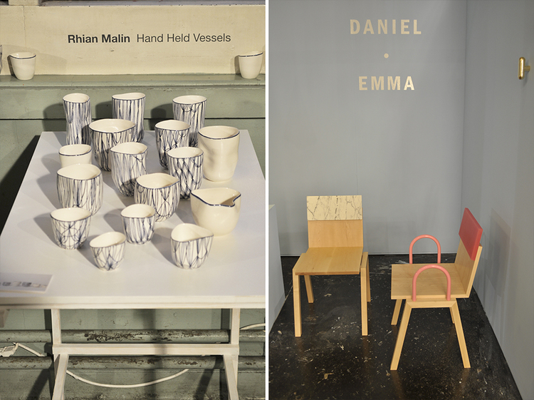
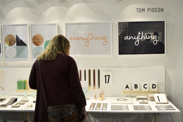
designjunction is also a great place to discover new design talent and up and coming labels. This year, multi-award winning designer Jim Rokos introduced a line of sculptural objects including bowls and vases and Rhian Malin presented a collection of tactile vessels created by inviting participants to gently squash a freshly thrown porcelain vessel to the shape of their hands, making each of them completely unique. Design studio Daniel Emma showed Mish Mash, their first chair handmade in Adelaide by a local craftsman and one of our favourites was new jewellery, prints, stationary and product design brand Tom Pigeon.
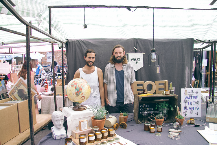
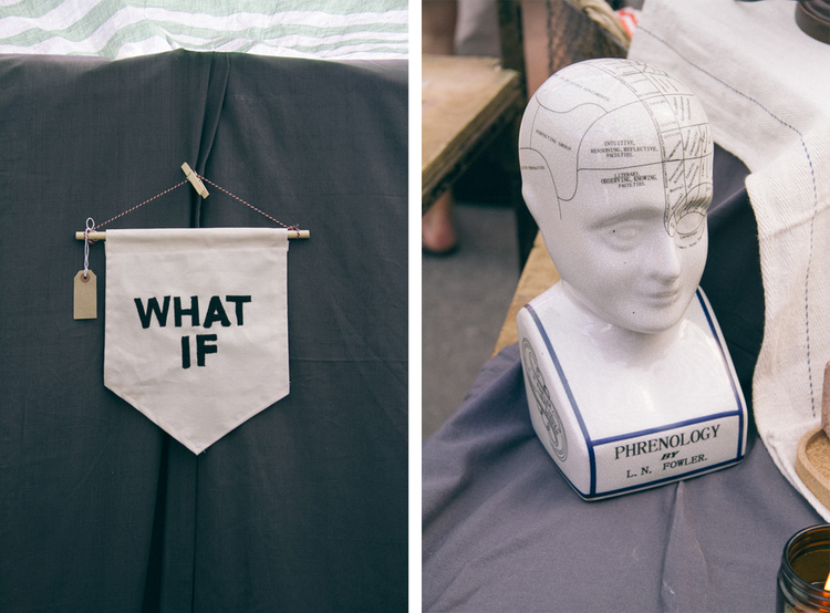
On our last trip to London we met Paul Firmin and Niko Dafkos, the founders of Earl of East London. Inspired by their travels and love of beautifully produced vintage homeware, they launched an online shop and market stall in Netil Market a few months ago with an ambition to turn it into a lifestyle brand.
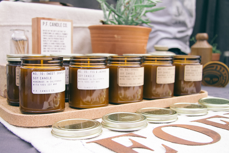
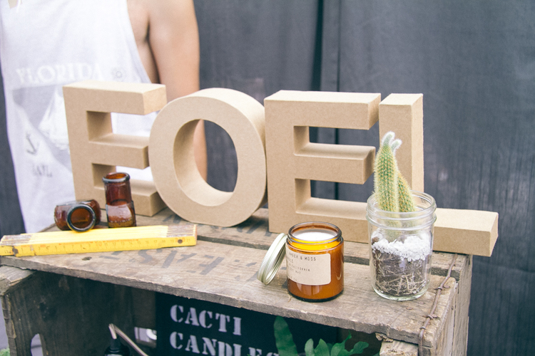
Earl of East London sells a curated mix of vintage curiosities, candles and cacti which combines their passion and interest in seeking out independent businesses producing beautiful objects. Paul says: “I think initially that might sound like a strange mix but I suppose what we are really trying to sell is an eclectic lifestyle, one which is inspired by living in East London, from places we have travelled to and from the media we choose to read. We only stock things that we love and would have in our home”
Currently Earl of East London focus on bringing goods from the US where they spent some time last year. “We particularly love the eclectic mix of businesses and products from California, geographically its well positioned to have so many influences and thats why its such interesting and a hub of creativity. We love how supportive the creative community is of each other there but how they are also very business minded in a way that creatives sometimes struggle with”, Paul adds.
Look out for Paul and Niko and their stall at the Netil Market most weekends, and follow their Instagram, Facebook& Twitter for the newest updates.
Photography is really an abstract art posing as conceptual realism. You’re not just capturing something as it is, but rather, you’re capturing a perception of what something is. We all know that although cameras work a lot like the human eye, they don’t’ see as we do. They have better focus, more range of color interpretations and they can even make optical illusions where once there were none to be found. Maybe that is why neutral is so important for us. In so many ways, neutral backgrounds are useful to our eyes and it’s because they help us to perceive objects both as they are, and as they could be in our minds. But where does this occur in the real world?
If you were a small business, you would want your product to be shown in the best light. There’s no other way to do this than in a photography studio. This is because the neutral background, adaptability for the space to become anything you want, (which helps in perception manipulation) and lighting changes, is so useful to product photography. You can hire a photography studio that can look like a living room, a garden, an outdoor living area or pretty much anything you want. They are inherently empty but not quite, empty. They have room to maneuver, change, adapt and be made in such a way, as to build up the image of a product. The most important thing is, having neutral walls. White, beige, cream, silver, black and grey are the colors permissible.
Bringing out your features
Neutral Backgrounds are also used for headshots. Actors want their features to blossom and stand out, so a white background is chosen. But for those that want to change the shape of their face, or perhaps bolster their age, they could choose a black background instead. It’s a tug of war that’s been going on among actors for many decades, in terms of which is better. But the truth be told, they are both better than having something in the background. The entire focus should be on you. And the only way to do that is to use colors which don’t conflict with your skin, eyes and hair. Headshot photographers charge a petty penny too, because they know how to focus on your face and yet still keep the neutral background in focus too. This way your features can look both natural and more defined.
More depth and variety
Modern homes have neutral walls and that is a godsend to photographers in the real estate market. By having white or black walls, the decor stands out more. The changes of shape, color and size, play a more magnified role in the photography of interiors because of it. It’s also why so many people like the minimalist style, because they want more of what they like, to stand out and not be overshadowed.
The neutral background in photography is at first glance, rudimentary. Bt actually, when you do it right and you have the right subject, you bring out the best in it.
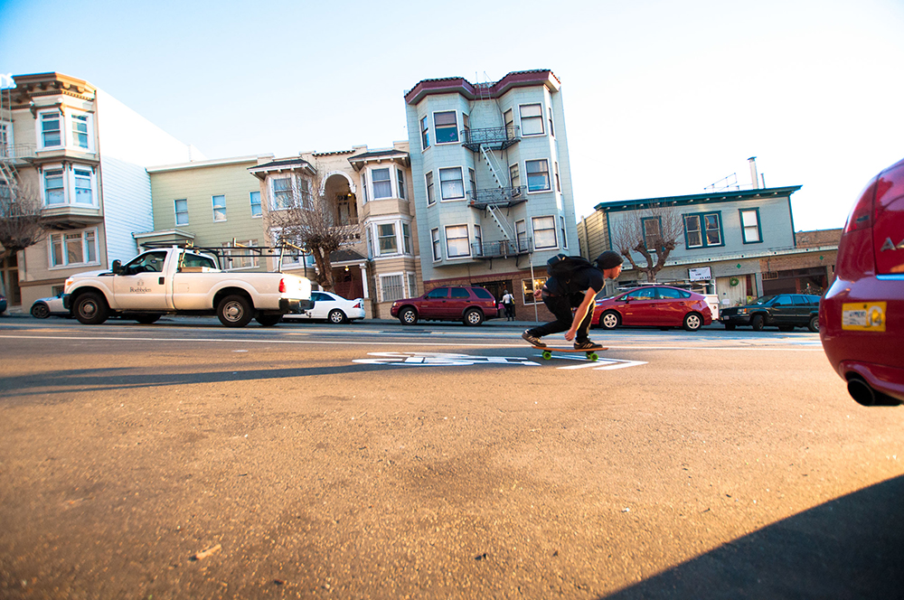
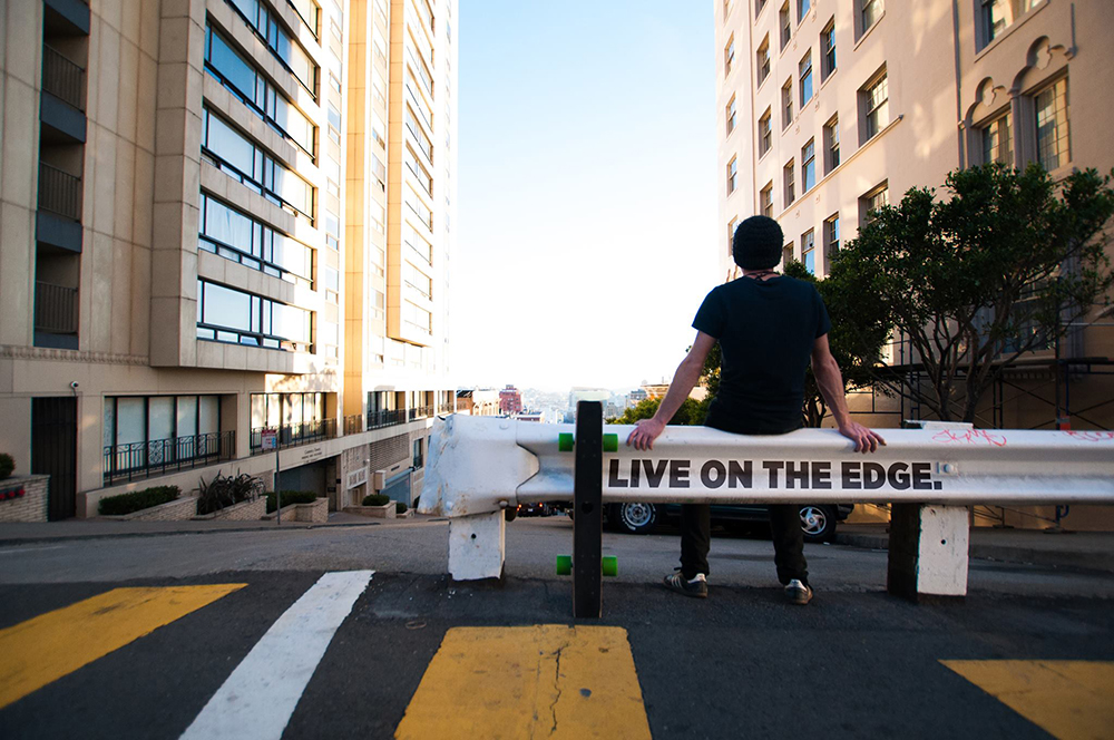
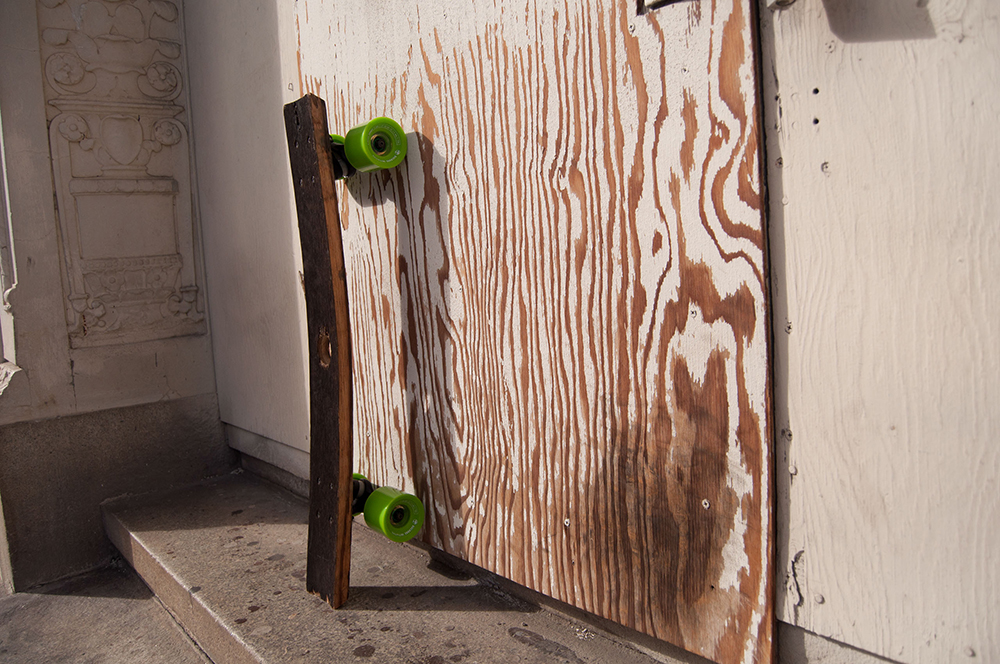
Hepcat is a start-up lifestyle brand based in San Francisco founded by Nash Finley and George McDonough. The brand focuses on sustainable design, and explores alternative materials, manufacturing techniques and outside of the box thinking.
Bourbon Barrel skateboards are the first of many products that Hepcat hope to put out to the world. We all know that upcycling can get a little crafty so it’s always great to see a nice example of reusing materials done right. We’re definitely looking forward to seeing more products coming from the brand.
Hepcat is currently running a Kickstarter campaign which you can support here.
If you have a product or project you’d like us to write about, please email us at hello@thefuturepositive.com.
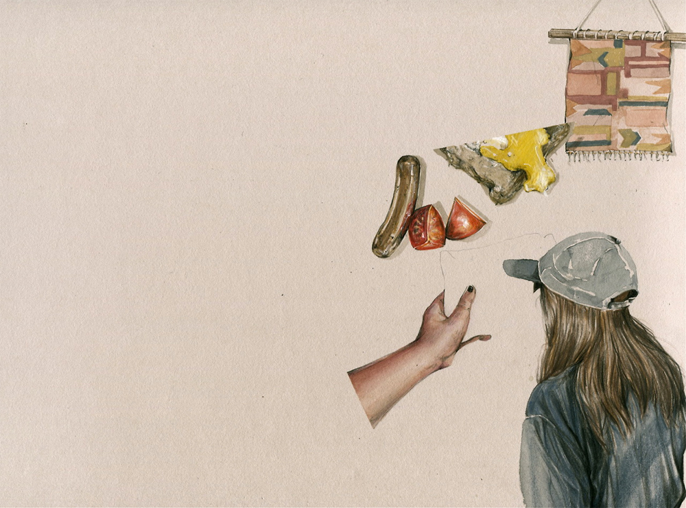
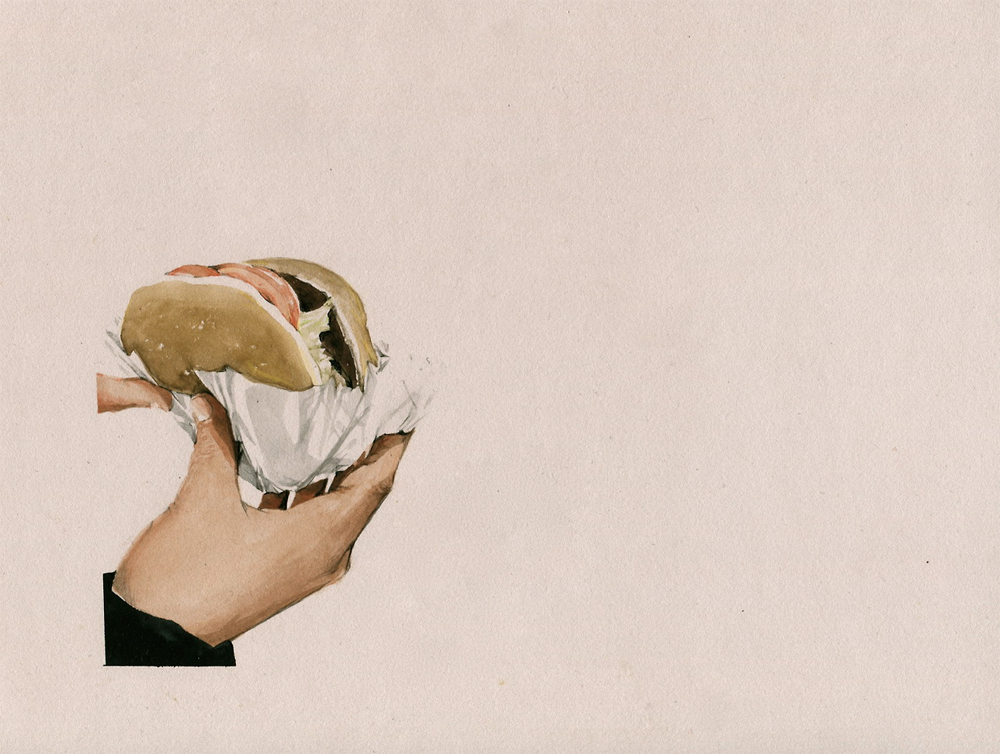
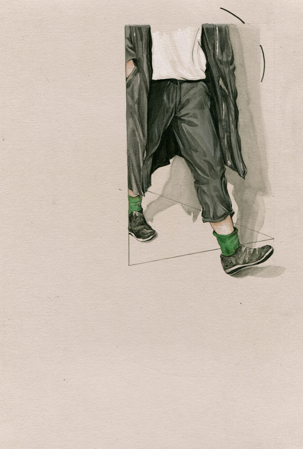
We recently discovered the work of Evie Cahir, a Melbourne-based illustrator who has worked for clients the likes of Vice and Neon Magazine and is inspired by drawing on public transport.
Evie says that there isn’t a technique as such in her work. She simply layers coloured pencils, applies weak watercolour washes and peels off strips of masking tape until she feels that the work is complete.
We especially like her project Mapping Melbourne – developed on her many trips across the city – and also her self published zines.
This website uses cookies to improve your experience. We'll assume you're ok with this, but you can opt-out if you wish.AcceptRead More
Privacy & Cookies Policy
Privacy Overview
This website uses cookies to improve your experience while you navigate through the website. Out of these cookies, the cookies that are categorized as necessary are stored on your browser as they are essential for the working of basic functionalities of the website. We also use third-party cookies that help us analyze and understand how you use this website. These cookies will be stored in your browser only with your consent. You also have the option to opt-out of these cookies. But opting out of some of these cookies may have an effect on your browsing experience.
Necessary cookies are absolutely essential for the website to function properly. This category only includes cookies that ensures basic functionalities and security features of the website. These cookies do not store any personal information.
Any cookies that may not be particularly necessary for the website to function and is used specifically to collect user personal data via analytics, ads, other embedded contents are termed as non-necessary cookies. It is mandatory to procure user consent prior to running these cookies on your website.