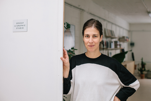
Stephanie Specht is a freelance graphic designer based in Antwerp, Belgium. Inspired by music, art and fashion, Stephanie describes her work as intuitive, abstract, typographic and minimalistic.
We chat with Stephanie to find out more about what made her become a graphic designer, her workspace and plans for the upcoming months.
www.stephaniespecht.com
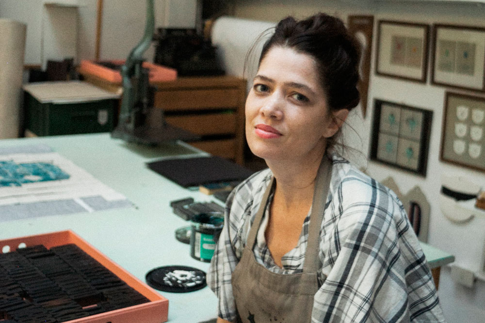
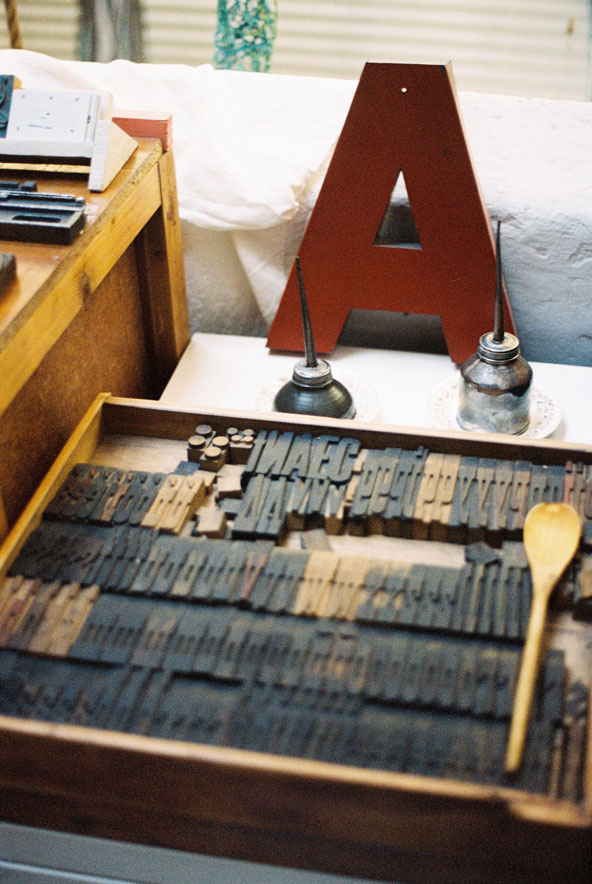
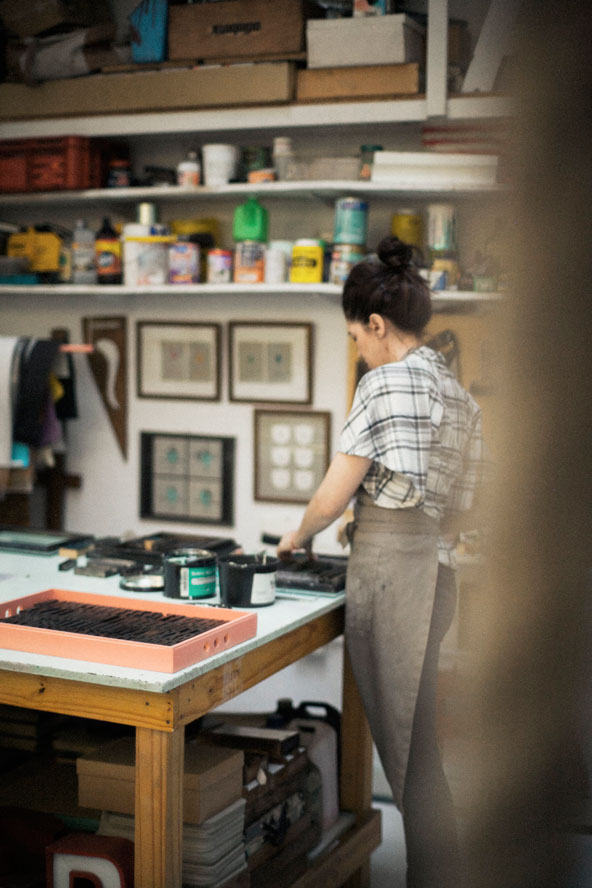
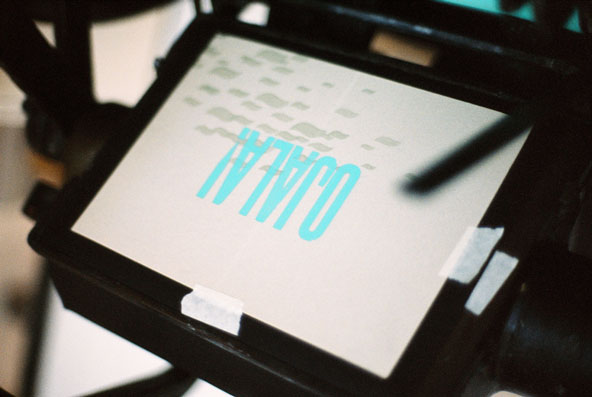
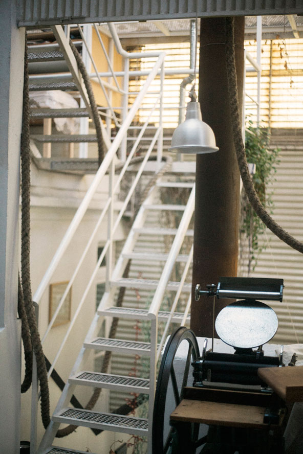
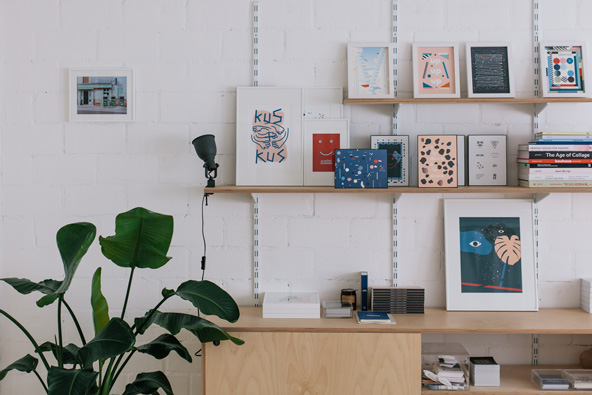
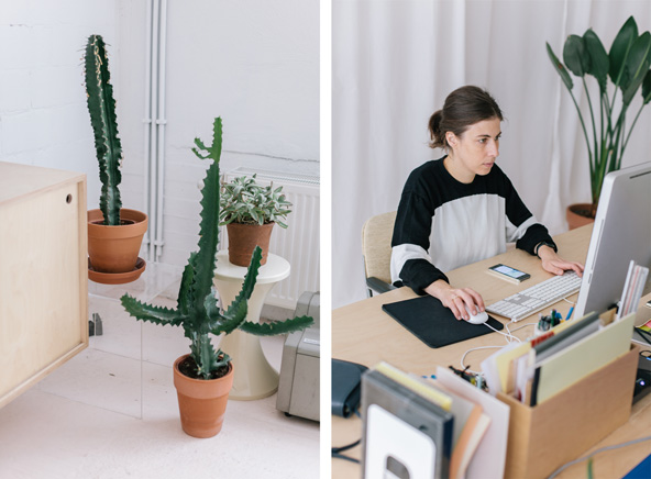
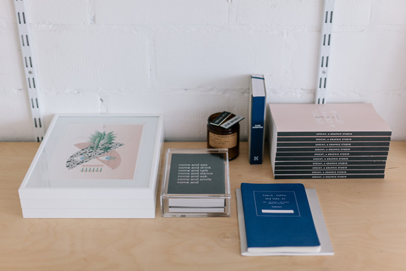
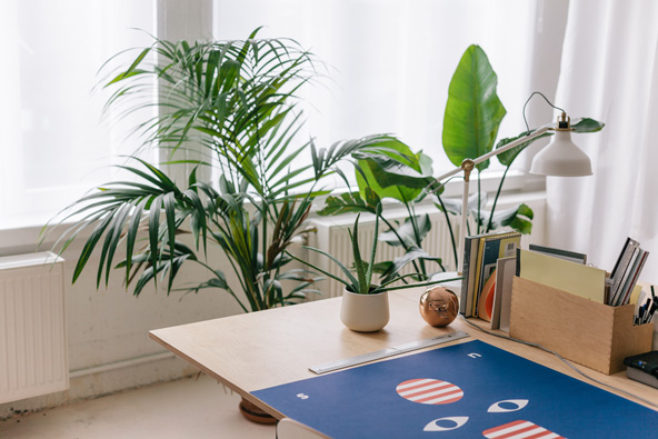
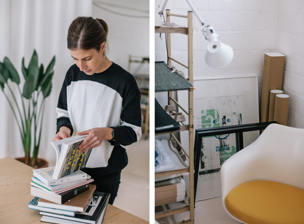
Studio photographs by Christophe Derivière.
Please tell us a little about your background and education. The bio on your website mentions that you lived and worked in so many places before going back to Antwerp!
I was born in Antwerp and I studied Graphic Design at the Royal Academy for Fine Arts. I worked at a company for a year and quickly realized I didn’t belong in a structure like that. Also, the routine was killing my creativity. I wanted to do my own thing.
I became self-employed in 2007. Initially, my plan was to stay in Antwerp but, due to a past relationship, I moved to all those different places: Cape Town, Brussels, Princeton and New York. I was living a modern nomadic life which was really inspiring but at the same time exhausting. After a while I really felt I wanted to settle down somewhere. Suddenly I wanted the opposite lifestyle than the one I was living. I was used to working from ‘home’, wherever ‘home’ would be but, if I look back at those couple of years, I think I wasn’t really 100% focused on my work. There was too much distraction.
It’s only been since 2014 that things really started changing for me. I decided I would stay in Antwerp for a longer time. I did not plan on moving anywhere soon again. I became more focused on my work and somehow attracted more interesting clients.
What made you interested in graphic design in the first place?
Initially, I wanted to become an architect. In Antwerp, where I grew up, I started an architectural design course when I was 16. I didn’t know what graphic design was, but I’d always loved to draw. At one point, one of my teachers advised me to change direction since my maths weren’t good enough. So I started a more general art course, and instead of focusing on buildings, I began looking at the style of architectural movements (Bauhaus, Brutalism, De Stijl, Modernism). I became fascinated by the lettering on buildings. Only by looking at these typefaces, you could tell the years in which these buildings were built. During my last year in high school, a typography teacher introduced me to graphic design.
Tell us about your workspace, Studio Specht, and its uses.
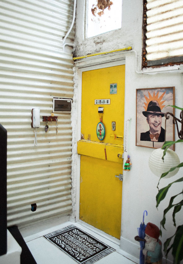
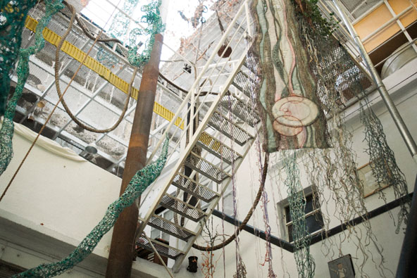
I moved into my first real ‘office’ at the beginning of this year. I really dislike the word office – it’s more like a creation room, a work space, a studio! My studio is in an old building materials warehouse. There are 12 studios in total, all occupied by creatives. The interior was designed by Nicolas Petillon. The space is really rectangular and when he suggested to use a ceiling-high curtain line in the form of a wave through the space, my first reaction was ‘why break this space!?’ But he was right. The curtain gives the space even more ‘space.’ I can open the curtain wherever I want and change the whole room.
I also have a marble Knoll table in my meeting room. It belonged to my grandmother who passed away a few weeks before I opened up the studio and I inherited it. The curtain follows the shape of the table and this space now almost feels like a sanctuary. It’s beautiful. I decided to paint my floor apricot white which adds a certain warmth and feminine touch to the all concrete white space. I also have a lot of plants. It feels like a soft jungle. Every time I walk into the studio I feel inspired and happy. Nicolas did a great job, really.
The first couple of months I organized a few Open Days where people could just come, walk in and look at new works I produced. I have done some collaborations that I’m really happy with and those works are also on view here. From time to time, I get emails from people who want to make an appointment to come and have a look at my studio. Sometimes they are just curious to see where I work, sometimes they want to buy an illustration. It’s nice to meet people this way, because they are different to my clients.
How would you describe your work? Where do you draw inspiration from?
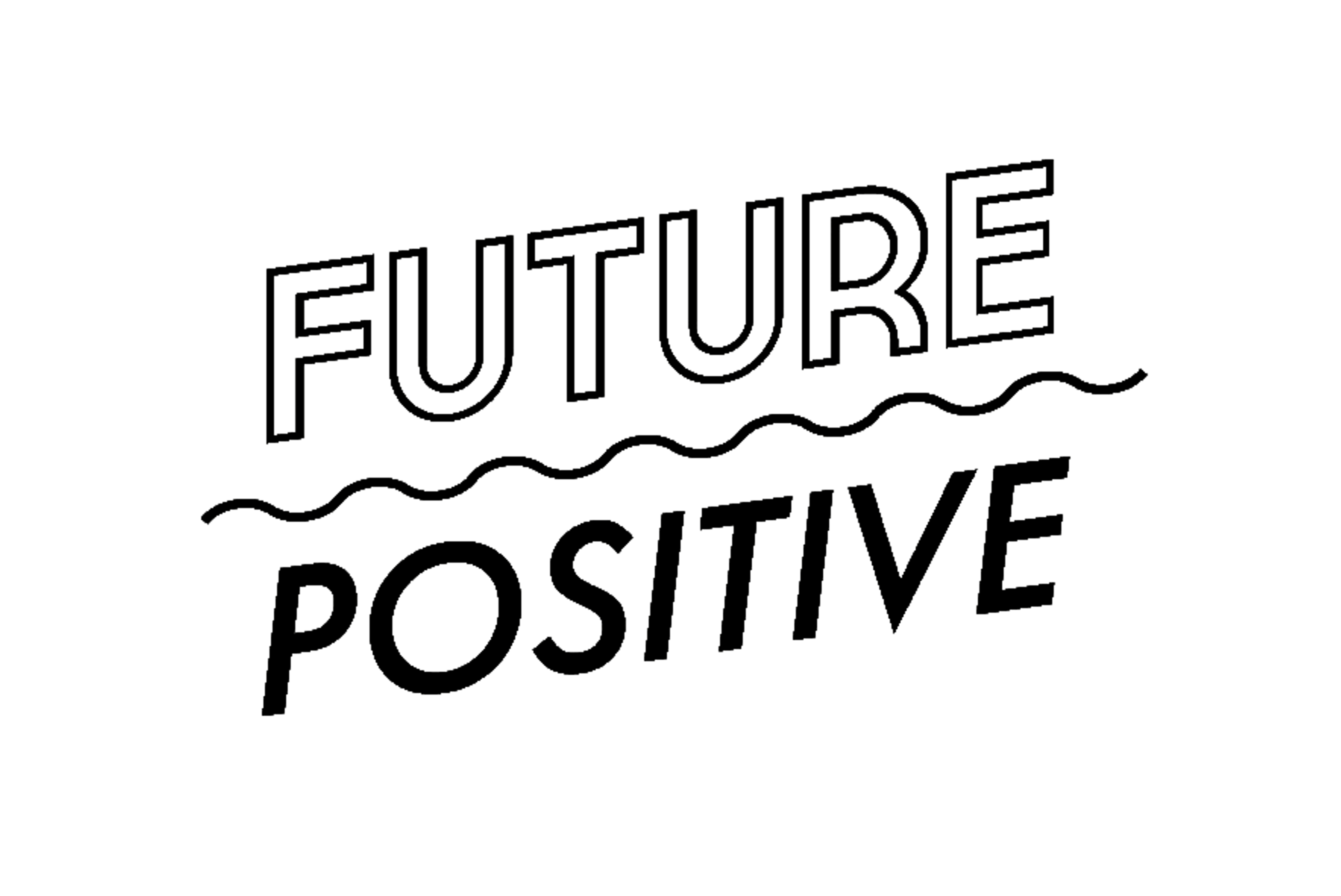
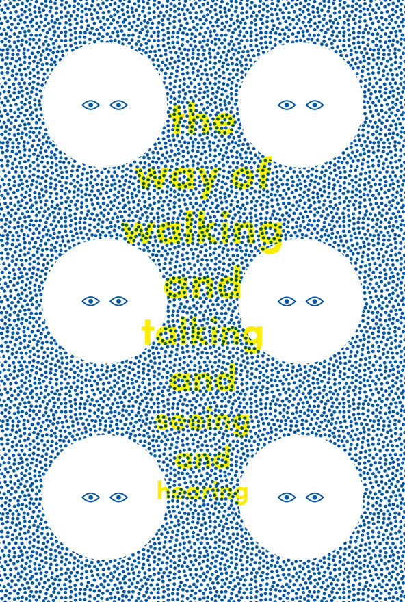
My work is intuitive, abstract, typographic and minimalistic. I love to find purity in lines and forms.
Music, art and fashion are a big source of inspiration for me – but it can be anything really; a conversation, a photograph…
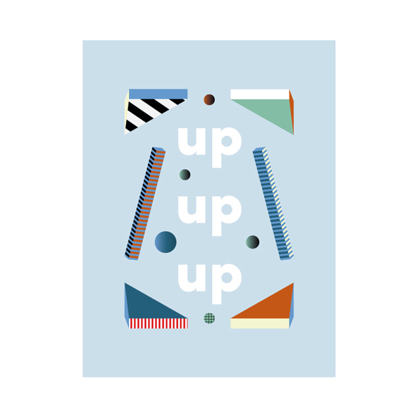
Do you have a particular favourite piece of work or something you feel especially proud of?
I think the Up Up Up illustration is one of my favorite personal works now. I recently created the identity for this new music documentary television show called Off the Record. It was the first time I designed something for TV. I am very happy with the result. It’s great to see my designs moving on screen!
What are your plans for the upcoming months?
I just finished a really intense book project in New York. I was there for two months. I am really tired so I am working on just a few jobs – I need to relax a little. Right now I am working on a redesign for S Magazine. S is a deluxe art and fashion biannual committed to gorgeous fashion photography, intelligent long-form articles, and experimental visual art. The magazine often changes style (designer). They have an identity but they like to play around with different typography and layout within the magazine itself.
I’m also busy updating Belgian artist Leon Vranken’s website. His work is amazing – I love working with his beautiful images. I also might design some new book covers for Das Mag, a new young Amsterdam based publisher.